
Why Rampancy Ramps Stay Consistent Across Every Hue
- color-theory
- oklch
- editor
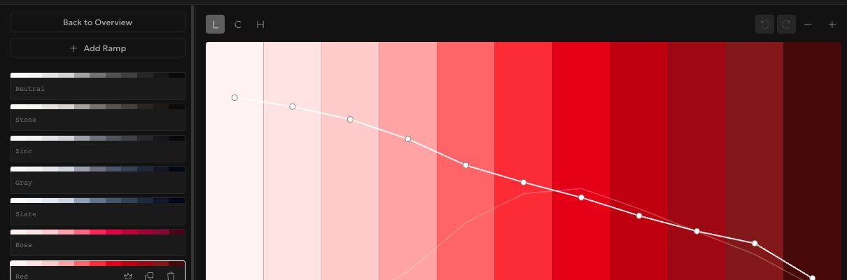
Set the same lightness curve on Rampancy's Red ramp and its Blue ramp, and step 500 in both will read as equally bright to your eye. That wasn't reliably true before version 6.0.0. Ramps used to be built on HSL, and HSL's lightness value isn't perceptually uniform: a yellow at 50% lightness looks noticeably brighter than a blue at that same 50%. Rampancy now builds ramps on OKLCH by default, a color model where lightness tracks how bright a color actually looks, independent of hue.
What You'll Need
- Any ramp to experiment on. The built-in Tailwind preset works if you don't have one handy. No account needed to open the editor and shape a curve
Step 1: Compare lightness across hues
Open a palette in the editor and pick any ramp. The curve panel defaults to the L (Lightness) channel, plotted as a line across your ramp's steps, each point showing the exact lightness value at that step. Scroll the sidebar and you'll notice something: ramps with completely different hues, Red, Green, Cyan, Violet, all carry roughly the same lightness shape from step 100 through 1100. Under HSL that alignment used to drift; a saturated yellow ramp would visually "run out" of dark steps long before a blue one did. OKLCH fixes that at the color model level, not by fudging individual values.
Step 2: Shape chroma instead of guessing at saturation
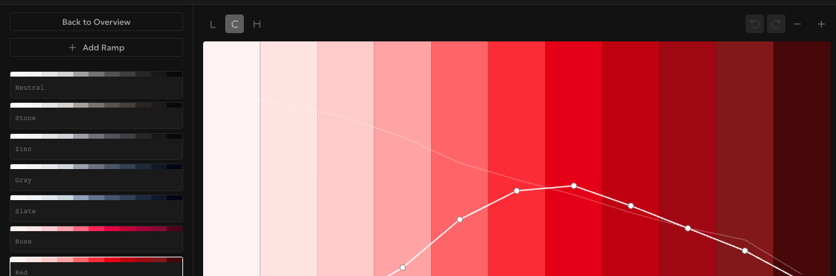
Switch to the C (Chroma) channel and you're editing how intense or muted each step is, OKLCH's replacement for HSL's saturation. It isn't a straight swap though. Chroma is unbounded in theory but Rampancy clamps it to what's actually renderable, so if a curve pushes a step past the color's real gamut, that step gets pulled back to the nearest displayable color automatically. You never end up with a swatch that quietly clips to something else in CSS. I broke a purple ramp this way once while testing, cranked chroma way past what magenta at that lightness can hold, and watched Rampancy just clamp it instead of rendering garbage.
Step 3: Let hue drift on purpose
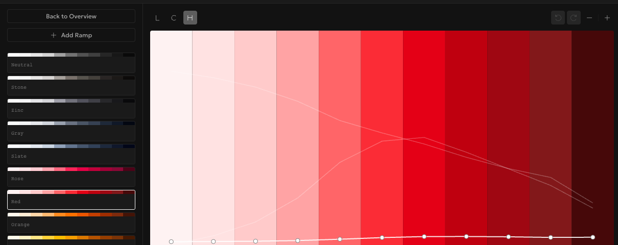
The H (Hue) channel looks like it should stay flat, one hue, one ramp, right? Not quite. A tiny hue shift across steps is what keeps a ramp from looking flat and synthetic, the same trick Tailwind's own palettes use under the hood. Rampancy plots this drift as its own curve so you can see and adjust it rather than guessing. There's also a Hue Shift slider in the Curves panel for nudging the whole ramp's hue left or right without touching individual steps.
Step 4: Export native oklch() values
Open Export from the palette panel and pick CSS Custom Properties. Rampancy writes each step as a --color-[name]-[step] variable with a native oklch() value inside a :root block, ready to paste into any stylesheet. No conversion step, no hex fallback you have to remember to update. Tailwind CSS export does the same thing for a @theme block if that's your setup.

FAQ
Do I need to redo my existing palettes?
No. Any palette built before 6.0.0 converts to OKLCH automatically the first time you open it in the editor. Your saved lightness and hue relationships carry over; you're just editing them on a better model going forward.
What happens to colors that fall outside the sRGB gamut?
Rampancy clamps them to the nearest color your screen and CSS can actually display, rather than letting the export contain a value that renders differently (or not at all) depending on the browser.
Does switching to OKLCH change how I read contrast in the sidebar?
The Min. Contrast field in the Accessibility panel is unchanged in this release, it still checks against your foreground and background colors. OKLCH just gives that check more consistent lightness values to start from, hue to hue.
Can I build a ramp in HSL or RGB instead?
Since 6.19.0 you pick a color space when you create a palette: OKLCH, OKHSL, HSL, or RGB. OKLCH is still the default, and everything above is written for it. If you'd rather reach for HSL's familiar knobs or raw RGB channels, the four-space walkthrough shows how each one edits and exports.
Open the editor on any palette, no account required. The Lightness curve alone is worth five minutes of poking at.